Webnafi Company Logo

  • Stanje: Closed
  • Nagrade: $70
  • Prejetih vnosov: 183
  • Zmagovalec/ka: dlanorselarom

Navodila natečaja

I need a logo for my Web Desing/Collaboration Company. At Webnafy, I act as a project manager and get talented people together from all over the world to work on my client's online presence. This involves Social media, web design, branding, SEO, and more. The portion I am always getting help on is logo design, this is not my strong suit.

There are three names that the business may use, two in addition to Webnafi and they are Biznafi and Technafi.

The winning design will need to hand over all design files at project closure and the elements. Illustrator is the preferred source document and vector graphics are a must. If Illustrator is not used, the master file must be able to be opened and edited in Illustrator or Gimp.

EDITS FROM CLARIFICATIONS:

Color Scheme is open but please avoid gradients and use of more than three colors.

If you submit an overused logo design your entry will be rejected. See this link to see if your submission will likely be viewed as overused. https://overusedlogodesigns.wordpress.com/

Any work that is a plagiarization of another companies logo or another entry will be disqualified.

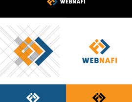
Possible concepts for a logo may involve the letters F and i written as Fi, fI, FI, or fi. Could be in HTML style tags like < fi > or </ fi >

Priporočene spretnosti

Delodajalčev feedback

“Ronald was very responsive to suggestions and tweaked his unique design without complaint. His initial concept was right in line with what I was asking for, but looked for oppertunities to improve upon his work. Very professional. ”

Profilna slika Webnafy, United States.

Javna tabla za pojasnila

  • graphicspine1
    graphicspine1
    • pred 4 let

    see this #276

    • pred 4 let
  • JANtyle
    JANtyle
    • pred 4 let

    please check my entry #273 #274

    • pred 4 let
  • kawsarh478
    kawsarh478
    • pred 4 let

    please check #219

    • pred 4 let
  • asmakhatun72622
    asmakhatun72622
    • pred 4 let

    please sir check this Entry #214

    • pred 4 let
  • shadatmizi67
    shadatmizi67
    • pred 4 let

    please check #177 and #178 ...

    • pred 4 let
  • shadatmizi67
    shadatmizi67
    • pred 4 let

    please check #168 and #169 ...

    • pred 4 let
  • Webnafy
    Nosilec natečaja
    • pred 4 let

    Please submit your entries without a mockup. You may include both if you choose, but a standard image for judging is required.

    • pred 4 let
  • Webnafy
    Nosilec natečaja
    • pred 4 let

    I just added my own work as an example. I would love to hear peoples thoughts and see what new submissions it may trigger.

    • pred 4 let
    1. KColeyV
      KColeyV
      • pred 4 let

      Wait for a new entry from me.

      • pred 4 let
    2. raziul99
      raziul99
      • pred 4 let

      please check #84 .....

      • pred 4 let
  • Webnafy
    Nosilec natečaja
    • pred 4 let

    It is looking like the < / > tag is difficult to balance with the rest of the font. Maybe thickening up the lines would help?

    • pred 4 let
  • KColeyV
    KColeyV
    • pred 4 let

    CH, do you have some graphic idea of what symbol or font you want?

    • pred 4 let
    1. Webnafy
      Nosilec natečaja
      • pred 4 let

      I think that would work really; using the letters F and i to make a symbol.

      • pred 4 let
    2. Webnafy
      Nosilec natečaja
      • pred 4 let

      I am trying to put it as a tag and it keeps getting marked down. Maybe < / f i >

      • pred 4 let
  • KColeyV
    KColeyV
    • pred 4 let

    I understand the "why" of the nafi-brands now. Hahahaha

    But, I need some graphic guide to make the better logo for it. Hope we can talk about it.

    • pred 4 let
  • KColeyV
    KColeyV
    • pred 4 let

    Check #47

    • pred 4 let
  • KColeyV
    KColeyV
    • pred 4 let

    U r welcome, Mr. I recommend that you directly reject any plagiarism or overused design.

    • pred 4 let
  • KColeyV
    KColeyV
    • pred 4 let

    Be aware of overused and mockup logos https://overusedlogodesigns.wordpress.com/2018/06/24/overused-logo-designs/

    • pred 4 let
    1. Webnafy
      Nosilec natečaja
      • pred 4 let

      Yes sir, they are very unlikely to win this competition. Notice I always rate the mockup the same as the flat image. Thank you for being here!

      • pred 4 let
  • Webnafy
    Nosilec natečaja
    • pred 4 let

    These contests inevitably have lots of submissions where people submit a slight variation of another freelancer's submission. This is highly discouraged and will lower my overall impression of the entry or get it rejected.

    • pred 4 let
    1. KColeyV
      KColeyV
      • pred 4 let

      Yes, unfortunately that is very common on this platform, and still they usually win.

      • pred 4 let
  • hasyathirahh
    hasyathirahh
    • pred 4 let

    hi please check my entry #16 #18 and rate it. thank you

    • pred 4 let
  • Webnafy
    Nosilec natečaja
    • pred 4 let

    I have not chosen a scheme but would like to keep the colors down to two or three max. Gradients are discouraged.

    • pred 4 let
    1. frogart0076
      frogart0076
      • pred 4 let

      Check #15 #17 entry

      • pred 4 let
  • KColeyV
    KColeyV
    • pred 4 let

    Do you prefere some color scheme?

    • pred 4 let

Pokaži več komentarjev

Kako začeti z natečaji

  • Objavi ta natečaj

    Objavi svoj natečaj Hitro in preprosto

  • Prejmi na tone vnosov

    Prejmi na tisoče vnosov S celega sveta

  • Dodeli natečaj najboljšemu vnosu

    Dodeli natečaj najboljšemu vnosu Prenesi datoteke - Preprosto!

Objavi natečaj zdaj ali pa pridruži se nam še danes!