
techstudio057
Bangladesh

PLEASE CHECK ATTACHMENTS AND READ FULL BRIEF
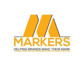
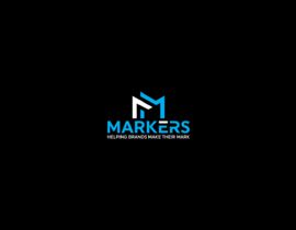
The company name is Markers.
The slogan: helping brands make their Mark.
Company Background:
The business in short is about collecting data from a population sample and analyzing it then coming up with recommendations for the clients/brands. A decision support system that guides the brands decisions, allowing them to make the best deicisons for their products or services, whether it be communicatrion, positionning, promotions, user experience etc.
Objectives of the logo:
Portray the personality of Markers, through 1 of these 2 directions or both if not too much.
The personality is: energetic, dynamic, fast, focused, driven, wise, passionate, professional, elegant, formal, upbeat, loyal, transparent (although i wouldn't stress much on that element in the logo), sophisticated, innovative and straightforward
The Logo has to imply formality and Dyanmism at the same time and possibly imply forward movement
2 directions to go with
1- Reflect the slogan: helping brands make their mark.
2- A subtle Arrow like marker, for the Symbolism of a marker is usually an arrow head, it portrays speed, aggressiveness, accuracy, guidance, direction, and if we point it towards 1 Oclock it would point towards number 1, or market leadership, as well as growth and a forward movement.
Colors prefereably but not limited to: shddes of Blue, deep navy or gradiant turquoise, vivid lively red
I would recommends that shapes have a bit of gradiant effect, the trendy type.
Target Audience:
brands from all sectors, brand managers, other Market research consultancies and companies
Attached is a logo i really like for TPICAP, it has bright colors, very neat and most importantly gradience is not unidirectional there is contrast and movement, it is very eye soothing and attractive at the same time, perhaps tweak the concept to have vivid red to blue gradience, and add the arrow element somehow maybe even a subtle M shape
I also attached Firefox lgos fore reference, notice the 3d Shapes and shadowing effects
Overall style look:
Smart, modern, hip, formal yet friendly, professional


Objavi svoj natečaj Hitro in preprosto

Prejmi na tisoče vnosov S celega sveta

Dodeli natečaj najboljšemu vnosu Prenesi datoteke - Preprosto!