Logo/Graphic Recreation/Redesign
- Stanje: Closed
- Nagrade: $300
- Prejetih vnosov: 26
- Zmagovalec/ka: sharaa10

Navodila natečaja
Please see attached graphic (LogoRedesign.PNG) before reading description.
Redesign the attached 3 graphic elements.
Keep the same general colors (reds, whites, blacks, and golds).
Keep the same elements (a seal, ribbon, etc).
These mockups were done using art from istockphoto and we would like them recreated in original art.
We are not looking for direct copies of these, but original version of the same idea.
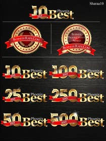
A.) 10 Best - this is an element that is used on awards presented by our company - it should match in color and style to the other elements (B and C).
B.) Logo - this is our logo
C.) Logo variation - this is our logo with additional tagline text below it.
NOTE:
Entries must include all three A B and C graphics
Samples for A in the contest need only include the "10 Best" variation of the graphic A. However, final delivery will need to include variations for:
10 Best
25 Best
50 Best
100 Best
250 Best
500 Best
Priporočene spretnosti
Javna tabla za pojasnila
-
thetouch
- pred 11 let
Apologies, Its entry no. 41
- pred 11 let
-
thetouch
- pred 11 let
I have just submitted a last minute entry no. 37. Please consider the same.
Regards,- pred 11 let
-

sharaa10
- pred 11 let
Please check #31...
- pred 11 let
-

Nosilec natečaja - pred 11 let
Entry #4 : Comments: Make gold color of "10 Best" and "Seal" match. Use the ribbon style (gold banding, tapered ends) from the seal, and apply it to the 10 Best graphic. Use a different style points/fins on the seal. The current points/fins look like a saw blade.
- pred 11 let
-
Stevieyuki
- pred 11 let
How about entry #16 ?
- pred 11 let
-
zilonard
- pred 11 let
#27 #28 #29 i hope u like it
- pred 11 let
-
thetouch
- pred 11 let
Please check my updated entries #25 and #26
- pred 11 let
-

billebekrer
- pred 11 let
please chek #22
- pred 11 let
-

arudyoputro80
- pred 11 let
Dear Contest Holder
I revised entry #5 as your comment in entry #20
Thanx- pred 11 let
-
billebekrer
- pred 11 let
#19
- pred 11 let
-
billebekrer
- pred 11 let
please chek #18
- pred 11 let
-
Nosilec natečaja - pred 11 let
Entry #10 : Comments: On section A: Use a ribbon layout that is different than the one used on the seal. We want the color and style of the ribbon to match from A to B, but it shouldn't be laid out and folded the same as the one on the seal. In our example it is one ended and flows from right to left. On sections B and C - I like the variations that use extra ribbon connecting the seal to the ribbon (top right hand). However the gold seal and the front ribbon seem to be reused from the .ai file. Please create original art.
- pred 11 let
-
Nosilec natečaja - pred 11 let
Entry #5 : Comments: Please provide more detail in the center of the seal. Additionally, on the ribbon on A - have the ribbon be more like the original version (thicker, coming from right, etc). Additionally, replicate the gold "look" of the seal and apply it to the letters of 10 Best.
- pred 11 let
-

ezesol
- pred 11 let
Dear CH, please check my entries different design, style Font & colors appreciated feedback thanks
- pred 11 let
-
Nosilec natečaja - pred 11 let
To clarify: Entries #4 and #5 are done correctly. Entry #1 is not.
- pred 11 let
-

badcom
- pred 11 let
Thanks for the feedback, I will work on another for you...
- pred 11 let
-
arudyoputro80
- pred 11 let
Dear Contest Holder,
Please find my design in #5 slightly different but still the same idea.
Regards, Arudyo- pred 11 let
-
Stevieyuki
- pred 11 let
Dear CH, I don't quite understand what you wanted so I try to make slightly different. And sorry about my entry #3, I don't know why the color inverted like that, it's fine in my computer. Please see my entry #4 instead, thank you. Regards, Stevie.
- pred 11 let
-
Nosilec natečaja - pred 11 let
All entries must include A B and C as seperate elements. Not one combined logo.
- pred 11 let
-
Nosilec natečaja - pred 11 let
All entries must include A B and C
- pred 11 let
-
badcom
- pred 11 let
Please see message with my entry. Thanks.
- pred 11 let
Kako začeti z natečaji
-

Objavi svoj natečaj Hitro in preprosto
-

Prejmi na tisoče vnosov S celega sveta
-

Dodeli natečaj najboljšemu vnosu Prenesi datoteke - Preprosto!