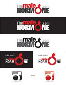
Logo Design for TheMaleHormone.com
- Stanje: Closed
- Nagrade: $290
- Prejetih vnosov: 168
- Zmagovalec/ka: digitalmx

Navodila natečaja
An informational website that will discuss the science and health aspects of testosterone, the primary male hormone. Our target market is men over the age of 30, typically looking to restore a more youthful state of energy/muscle/strength.
Priporočene spretnosti
Delodajalčev feedback
“Extremely happy with the design, as well as the professional advice. A+”
![]() mnbody, United States.
mnbody, United States.
Javna tabla za pojasnila
-
malakark
- pred 11 let
Congrataulations!!! Digitalmx
- pred 11 let
-

digitalmx
- pred 11 let
Thank You!
- pred 11 let
-

misutase
- pred 11 let
felicitari si la mai multe !
- pred 11 let
Poglej še 1 sporočilo
-

Raenessest
- pred 11 let
Congrats!!^^
- pred 11 let
-
digitalmx
- pred 11 let
Thank You! :)
- pred 11 let
-

AymanWadi
- pred 11 let
dear contest Holder....well you plz recheck designs #300 #301 #302 #303.........giving a rate will be REALLY appreciated..
thnx- pred 11 let
-
Raenessest
- pred 11 let
Hi please refer to #208 and #209 .
Concept is using a mesh of masculine symbols eg. the triangle, arrow and universal male sign. The whole formation of the logo (including text) is designed to look like an arrow, which is the prominent feature of the universal male sign as well.
Please give me some feedback as I would like to better my designs, even if you don't choose it. I very much appreciate it, thanks :)- pred 11 let
-
digitalmx
- pred 11 let
Why the arrow is in the left and not in the right? :)
- pred 11 let
-
Raenessest
- pred 11 let
in 209 there's one with the arrow on the right. But I felt it wouldn't be balanced if I placed the icon on the right of the words :S
- pred 11 let
-

ramm1987
- pred 11 let
#183
- pred 11 let
-
ramm1987
- pred 11 let
#39,#68,183,#186,#187..thanks
- pred 11 let
-

Noc3
- pred 11 let
#267 as well . thanks
- pred 11 let
-

bcendet
- pred 11 let
#344 . thanks.
- pred 11 let
-

dependent87
- pred 11 let
#22 pls
- pred 11 let
-

farhanpm786
- pred 11 let
what is creativity?? it is new ideas and concepts or the new association of existing ideas or concepts, so be creative and respect other designers!!
- pred 11 let
-
dependent87
- pred 11 let
robertcjr don't cry... does not win either! There are much better jobs of our
- pred 11 let
-

r3x
- pred 11 let
hi, please check #321 , thank you.
- pred 11 let
-

bhetzkie
- pred 11 let
intellect... #304
- pred 11 let
-
AymanWadi
- pred 11 let
ok...i think my idea is new......plz check #300 #301 #302 #303...hope to hear some feedback
- pred 11 let
-
digitalmx
- pred 11 let
Clarity is more important than persuasion, Your Corporate Identity is also an important attraction mechanism for your company, therefore it must look good and be aesthetically pleasing to the customer. I work in industrial design and advertising therefor when i make a logo it has to be easy to place on any kind of material without major change. Cheers! Let the best design win!
- pred 11 let
-

ipanfreelance
- pred 11 let
- pred 11 let
-
farhanpm786
- pred 11 let
nice, it have a feel!. i think adding a plus icon could be attracted by the client!!
- pred 11 let
-

vikram1989
- pred 11 let
- pred 11 let
-

HAROON1111
- pred 11 let
plz check #259 thnx...
- pred 11 let
-

JuanFranco
- pred 11 let
#249 Please... simple text but has impact while still having the 2 oxygen parts
- pred 11 let
-
bhetzkie
- pred 11 let
Simplicity...design #240
- pred 11 let
-

kalyaniganesh
- pred 11 let
#239 plz , i saw that u suggested for a text treatment , hope it will . thanx .
- pred 11 let
-

BetaK
- pred 11 let
#232 just came out of the bathroom :D
- pred 11 let
-
BetaK
- pred 11 let
...and font changed
- pred 11 let
-
BetaK
- pred 11 let
#216 ?
- pred 11 let
-

smarttaste
- pred 11 let
- pred 11 let
-

era67
- pred 11 let
- pred 11 let
-
Nosilec natečaja - pred 11 let
Hi everyone. Thank you all again for working so hard on this..!! I wanted to give you a quick update. At this time, we're leaning towards the 1 design we flagged as 5 star. It conveys what we want in a simple elegant ICON. I don't want to instruct everyone on ways to improve their designs, as I feel bad asking anyone to work on it if I am not sure we're going to pick their design. I feel like I'm taking your time ;)
We have not decided 100%; we'll be fair to all contestants. If you do want to work on this still, we're looking for designs that have no sperm, or international MALE symbols..
Thank you again everyone ! You've been making our first experience with Freelancer such a great one!- pred 11 let
-

costindobrin
- pred 11 let
please check #214 #213 #212 the ideea it's life. Thanks
- pred 11 let
-
ramm1987
- pred 11 let
#183,#186,#187
- pred 11 let
-
Nosilec natečaja - pred 11 let
This is an interesting take on Ezeldeen's concept. I've definitely taken notice. Thank you!
- pred 11 let
-
BetaK
- pred 11 let
How about a guideline on a #155 ?
- pred 11 let
-
Nosilec natečaja - pred 11 let
I like the icon a lot; not 100% on the font.. Good one though!!
- pred 11 let
-

manikmoon
- pred 11 let
Any thoughts on #163 ?
- pred 11 let
-
Nosilec natečaja - pred 11 let
Not bad manikmoon... Nice working with the text..
- pred 11 let
-

annie28
- pred 11 let
plz chk #170 Awaiting your feedback sir.
- pred 11 let
-
Nosilec natečaja - pred 11 let
Nice... but we're avoiding designs with spermies.. Looks good though!
- pred 11 let
-

bawipuvaiphei
- pred 11 let
please check #127 thk's...........
- pred 11 let
-
Nosilec natečaja - pred 11 let
Nice choice of colors and layout, though I do feel like it conveys a "recycle" message..
- pred 11 let
-

aoelea
- pred 11 let
- pred 11 let
-
Nosilec natečaja - pred 11 let
I thought I commented on these. I do like them; the icon is simple but effective.
- pred 11 let
-

nickyrulz
- pred 11 let
please check #89 #90 #91 thanks
- pred 11 let
-
Nosilec natečaja - pred 11 let
I do like this, though since it is similar to Ezeldeen's design I'd go with his... he worked so hard on it.
- pred 11 let
Kako začeti z natečaji
-

Objavi svoj natečaj Hitro in preprosto
-

Prejmi na tisoče vnosov S celega sveta
-

Dodeli natečaj najboljšemu vnosu Prenesi datoteke - Preprosto!