Logo Design for Mobile Catering Van
- Stanje: Closed
- Nagrade: $54
- Prejetih vnosov: 37
- Zmagovalec/ka: Mrichings

Navodila natečaja
Hey guys, my contest has been extended, the logos i received earlier were ok but nothing grabbed me as a design i would like to go with.
HERE IS A NEW BREIF:
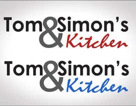
The logo is for my mobile fish and chip van, we visit different towns and villages and also cater for corperate events and public events. Here is a link to the current website where the new logo is needed for www.tomandsimonskitchen.co.uk. The new logo will also be going on the side of the van, leaflets and business cards.
The logo is to contain the words `Tom & Simon's Kitchen`
I DONT want any images included, just text please. I would like someone to do something more unusual and eye catching with the text whilst still keeping it clear to read.
Colour scheme to be either red and black or blue and grey (please feel free to enter the same entry in both colour schemes to see which looks best.
I have attached an image of the current van and i would like the logo to be similar to this in the sense of having something alongside it such as a fancy design/shape/lines etc. Or possibly even a fish as seen on the current logo (please see the attached picture).
I DONT want any borders or outlines around it, just simply the text and a little design or something alongside or underneath. For example a sketchy underline or something.
I will also need the logo as an AI illustrator file and a PSD photoshop file.
Thanks in advance guys and please contact me as soon as possible with any questions, were looking at getting this contest wrapped up as soon as possible.
Cheers
Priporočene spretnosti
Javna tabla za pojasnila
-

redacris
- pred 11 let
please check #222 , #223 & #228
- pred 11 let
-

alivadesigns
- pred 11 let
Hello, Please Check #189 & #188
- pred 11 let
-
alivadesigns
- pred 11 let
Hello, Please Check #188
- pred 11 let
-

LucianCreative
- pred 11 let
Hi, please check #172
- pred 11 let
-

Nosilec natečaja - pred 11 let
Hi guys, i definately either want the `tom` and `simons` in black, and the Kitchen in a deep red apposed to a bright red with a grey `&`.
Or the grey and blue i also like.
Having the Kitchen in the sketchy font written under the `simons` with the `&` bigger than the rest of the logo. Also my preference for the `&` is for it to be the same as the `&` used in design number 100.
Only 12 hours left guys. Keep up the good work!- pred 11 let
-

faisal7262
- pred 11 let
Sorry #166
- pred 11 let
-
faisal7262
- pred 11 let
PLz check #165
- pred 11 let
-
faisal7262
- pred 11 let
Plz check #161
- pred 11 let
-
faisal7262
- pred 11 let
plz check #159
- pred 11 let
-

inspiringlines1
- pred 11 let
Please Check #116 #117 #118 #119
- pred 11 let
-

edbryan
- pred 11 let
Hi Tom and Simon, Kindly check #98, #99, #100 , #101, #102, #103, #104 , #105, #106. Thanks
- pred 11 let
-
Nosilec natečaja - pred 11 let
Numbers 74,75,76 and 79 are well on track to what im aiming for. Maybe try the Tom & Simon's in italic and play around with underlining the text with a continuation somehow on the `kitchen` so it looks like its been written like a signature.
Thanks for everyones entries so far!- pred 11 let
-

sooclghale
- pred 11 let
plz check #84
- pred 11 let
-

saptarshinath
- pred 11 let
Please check #82.thanks.
- pred 11 let
-
Nosilec natečaja - pred 11 let
Number 74 is exactly the style im looking for. Possibly try the Tom & Simon's in itallic or a different font. And maybe see if something can be done with the `kitchen` to create an underline or something.
- pred 11 let
-
Nosilec natečaja - pred 11 let
Hey guys, i have an image in my head of a design like entry number 67(the bottom one of the two) with the `&` being bigger and the `kitchen` written under the `simon's` more? Also i have an idea in my head of the `Kitchen` being written in a more sketchy like font like a signature and a pencil like line underneath it that fades away if that makes sense?
I would very much appreciate if any of you would like to give this a go.
Thanks alot- pred 11 let
-

Mohamm6d
- pred 11 let
Please leave feedback about my submit , Isnt professional ?!
- pred 11 let
-
Nosilec natečaja - pred 11 let
Hey guys, i see the design of the logo going either one of two ways. It either needs to be simple and bold like numbers 60,61,62,67,63 or 64 or going down a different route of having the `Tom & Simon's` nice and bold and the Kitchen bit in a nice sketchy font but still easily readable. Then possibly underline it in a pencil looking sketchy scribble.
Please feel free to make multiple entries, the ones submitted so far have been great. Keep it up!- pred 11 let
-
Nosilec natečaja - pred 11 let
I like the simplicity of number 50 and both colour schemes look great.
Number 56 and 57 are nice, however im not sure about the backround, it may be difficult to reproduce onto a vehicle and it look right.
Cheers guys, keep it up.- pred 11 let
-

caroperezc
- pred 11 let
Hi, please see # 50. thanks!
- pred 11 let
-

AngiH70
- pred 11 let
Did anyone win?
- pred 11 let
-

niccroadniccroad
- pred 11 let
Hiya, thought I'd try something different and go with a traditional/retro one with #41
- pred 11 let
-
Nosilec natečaja - pred 11 let
Also maybe try doing the `Tom & Simon's` and the `Kitchen` in different colours, such as black and red, blue and silver. Typical complementery colours!
- pred 11 let
-

pranavansp
- pred 11 let
Hi, may i know ? what reason to reject 33 ? we can fix it. Thank you
- pred 11 let
-
Nosilec natečaja - pred 11 let
Hi everyone. Thankyou for the designs so far, i would like to get some using a red colour in them somewhere, possibly on the background or the `&` in the text.
Please message if you have any questions. Just over a day to go!- pred 11 let
-
Nosilec natečaja - pred 11 let
Hi guys, i like the designs of 24,23 and 21. However im definaetly now swaying more towards having any backround colours of either pale or dark blue, a slightly of white silvery colour or even just plain white.
Thanks for entering and keep it up. 2 days to go!- pred 11 let
-
Nosilec natečaja - pred 11 let
Number 7 is nice that it has an outline to encase the text. However as mentioned in the brief the main thing i am looking for is something fancy doing with the text so that its not just plain text or font. Something can easily be done with the & like in number 2 which i prefer also.
Cheers for entering guys, keep up the good work.- pred 11 let
-

neboflance
- pred 11 let
Hello! Pay attention to the number 5, Bon appetit!)
- pred 11 let
-
Nosilec natečaja - pred 11 let
I think it looks great but wont be 'bold' enough to go on any vehicle. would suit a business card though. Thanks for entering
- pred 11 let
-
niccroadniccroad
- pred 11 let
Hi, looks like I'm the first, so how's #1?
The contest caught my eye 'cause of Fish and Chips, something I miss so much and is the first thing I have when I get back to England (Yorkshire).- pred 11 let
-
Nosilec natečaja - pred 11 let
Hi, I like the logo but i dont think it represents the business for what it is if that makes sense. It looks like a diner or something, i drive around local towns and villages and dont think it quite represents what i do. Also our tagline for the business is 'for the very best fish and chips'.
Thanks for having a go though and your more than welcome to have another go.
If your ever Nottingham way then drop in for some of the best fish and chips youl taste!- pred 11 let
Kako začeti z natečaji
-

Objavi svoj natečaj Hitro in preprosto
-

Prejmi na tisoče vnosov S celega sveta
-

Dodeli natečaj najboljšemu vnosu Prenesi datoteke - Preprosto!