Help Improve a Flyer Design

  • Stanje: Closed
  • Nagrade: $30
  • Prejetih vnosov: 25
  • Zmagovalec/ka: banigandlapati

Navodila natečaja

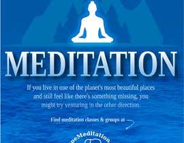
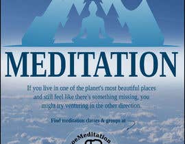
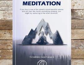
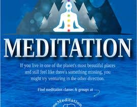
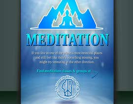
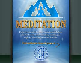
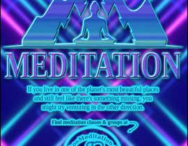
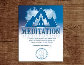
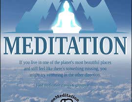
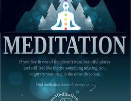
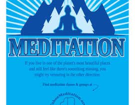
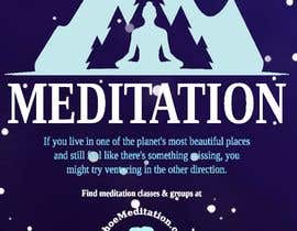
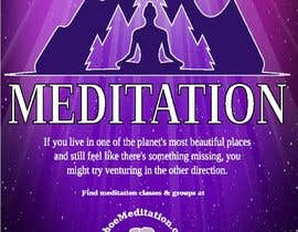
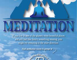
I have a flyer that I'd like to make a bit more visually exciting...

Perhaps it could be made less flat/boring by add some 3d/beveling... or add some color gradient... or some 60's psychedelic style (not sure what that would be, but we're just trying to make it more interesting/appealing).

You don't need to make a lot of changes.. perhaps just your single best idea for "enhancement".

Colors can be changed, but a MOSTLY BLUE theme is desired.

Attached are both a pdf and vector. Final product should be delivered as a vector.

Priporočene spretnosti

Delodajalčev feedback

“Very pleased with the design, and the quick revisions. Thank you!”

Profilna slika needprogramvw, United States.

Najboljši vnosi tega natečaja

Poglej več vnosov

Javna tabla za pojasnila

  • needprogramvw
    Nosilec natečaja
    • pred 6 let

    I think I have enough entries from which to make a decision. No new entries please. Thank you for all the great submissions.

    • pred 6 let
  • Dedijobs
    Dedijobs
    • pred 6 let

    please check #20

    • pred 6 let
  • rasselrana
    rasselrana
    • pred 6 let

    Check my entry #11

    • pred 6 let
  • needprogramvw
    Nosilec natečaja
    • pred 6 let

    Also, never mind the request for 60's/psychedelic effect. The couple attempts that have been made seem to make the design too "busy".

    • pred 6 let
  • needprogramvw
    Nosilec natečaja
    • pred 6 let

    What I like:
    1) BettyCH and R4NM4: Trees/clouds/texture at bottom is good. I'm thinking blue water/ripples/lake would be ideal. With light text.
    2) banigandlapati: I like the dark blue top and the light/white inner person. Also like the dropshadow on "MEDITATION" and the light text. That text could be a bit lighter.

    Don't like:
    1) While the 3d effect by plexocont is good, it's probably not right for this. Please ignore my 3d effect request for anything but "MEDITATION" text.
    2) BettyCH moved "MEDITATION" to the top. I prefer it in the middle.

    • pred 6 let

Pokaži več komentarjev

Kako začeti z natečaji

  • Objavi ta natečaj

    Objavi svoj natečaj Hitro in preprosto

  • Prejmi na tone vnosov

    Prejmi na tisoče vnosov S celega sveta

  • Dodeli natečaj najboljšemu vnosu

    Dodeli natečaj najboljšemu vnosu Prenesi datoteke - Preprosto!

Objavi natečaj zdaj ali pa pridruži se nam še danes!