Freelancer: naty2138
Delite:
Prijavi vnos

Face painter 5th variation

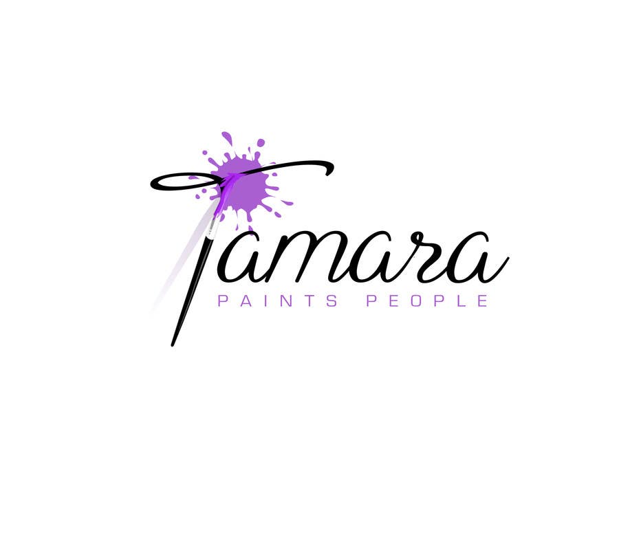
Hello Tamara, I've made changes you required, flat color, no gradient and different font caps, is this better?
Natečajni vnos #359 za                                                 Design a Logo for a face painter

Javna tabla za pojasnila

  • tamaragarcia
    Nosilec natečaja
    • pred 9 let

    Great job, this is very close to what I want. Everything is perfect, now the only concern is that "paints people" is a little tough to read when the logo is smaller. I'm not sure what you could do to make it more visible - bolder font, or a darker shade of purple for the design, or make the "paints people" text black...I don't know, you're the designer :) If this entry is chosen, what format will you submit it in?

    • pred 9 let
    1. naty2138
      naty2138
      • pred 9 let

      #491 bolder and darker, three options. I think, as I said in title there, the best is first one, just bolder and darker shade of violet, it's absolutely visible now and it doesn't change elegance of design, what you think?

      • pred 9 let
  • naty2138
    naty2138
    • pred 9 let

    I'm glad you like it :) It's not problem to make font more visible, I'll give you few versions, and then we'll see what is better for composition of image. You'll get all formats you'll need: EPS, JPG, PDF, PSD, TIFF...

    • pred 9 let