TorBox: Explanatory Illustration

  • Stanje: Closed
  • Nagrade: $250
  • Prejetih vnosov: 6
  • Zmagovalec/ka: carlosced

Navodila natečaja

TorBox is an easy to use, anonymizing router based on Raspberry Pi. TorBox creates a separate WiFi that routes the encrypted network data over the Tor network. The type of client (desktop, laptop, tablet, mobile, etc.) and operating system on the client don’t matter.

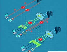
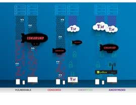
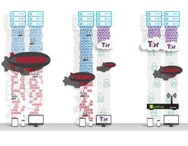
At the beginning of this project, I drew an explanatory illustration that shows three scenarios regarding of the protection of network data: regular access on data on the internet with no security, access websites with the Tor Browser and accessing data with a TorBox.

What do I search? A new professionally (but not technically) looking explanatory illustration that will replace the old one and, if possible, the integration of the reference that this is not only about data protection, but also about circumventing censorship.

I added the old drawn explanatory illustration, but all relevant information can be found here: https://www.torbox.ch

======================================================================================

Addendum (January 01, 2019)

Dear new participants,
welcome to the contest "TorBox: Explanatory Illustration". Feel free to submit your entry, but try to follow these hints:
- The final illustration will be used on the site http://www.torbox.ch, which has a specific design with colors, fonts and so on. Your entry has to fit the layout of this site.
- I know that my hint to the already hand-drawn illustration has probably the negative side effect of limiting the creativity of new participant. Important: YOU DON'T HAVE to stick to the hand-drawn illustration. If you have a way to explain, what TorBox can offer in comparison to both other cases, then feel free to submit something entirely new. This will raise your chance to win the competition.
- There are three effects which TorBox should accomplish: it should protect the entire data stream between TorBox and the exit node of the Tor network, circumvent censorship, and help to anonymize. That's the order of importance. If you have too few space to integrate all three of them, I don't care if you let the anonymization capacity away.
- Last but not least: The simpler the illustration, the higher the probability of winning the contest.

If you have any questions, feel free to contact me. Thanks for your participation.

Priporočene spretnosti

Delodajalčev feedback

“Carlos responds to customer wishes and also takes details into account. He presents his work with refreshingly unconventional ideas, which clearly set him apart from other competitors. ”

Profilna slika radio24, Switzerland.

Najboljši vnosi tega natečaja

Poglej več vnosov

Javna tabla za pojasnila

  • grok13
    grok13
    • pred 5 let

    Is the layout of the site strict or it's subject to change? This kind of graphic, even in its simplest form that it can get is not a suitable fit for that dimensions. I would suggest three column layout for the part of the webpage where the graphic will be displayed. in each column would be carefully designed icon with proper text explanation above or beneath it doesn't matter. this is a much simpler, cleaner and most importantly, it's an approach which is the most understandable for the end user/viewer.

    • pred 5 let
    1. radio24
      Nosilec natečaja
      • pred 5 let

      The layout of the site is currently not open to discussion.

      • pred 5 let
    2. grok13
      grok13
      • pred 5 let

      Right, I see. Thank you very much for answering.

      • pred 5 let
  • radio24
    Nosilec natečaja
    • pred 5 let

    Still 2 day to go

    • pred 5 let
  • MKatsarov
    MKatsarov
    • pred 5 let

    Hi there.
    Can I please get some feedback for entry#5 ?
    Thank you.
    Cheers.

    • pred 5 let
    1. radio24
      Nosilec natečaja
      • pred 5 let

      Hello .
      Of course... I like that you used the official logos (Tor, Tor Browser ...). However, the downside is that it looks like the different items were collected from different places which I don't like very much. At the moment, I have at least two other entry which I prefer. To give other participants a fair chance, I wrote message 1 and 2 in this "Public Clarification Board" with some hints.
      Sorry for this somewhat negative feedback.
      Best,
      Patrick

      • pred 5 let
    2. MKatsarov
      MKatsarov
      • pred 5 let

      No problem. Thanks for the feedback. Will try to come up with something better.
      Cheers.

      • pred 5 let
  • radio24
    Nosilec natečaja
    • pred 5 let

    Message part 1

    Dear new participants,
    welcome to the contest "TorBox: Explanatory Illustration". Feel free to submit your entry, but try to follow these hints:
    - The final illustration will be used on the site http://www.torbox.ch, which has a specific design with colors, fonts and so on. Your entry has to fit the layout of this site.
    - I know that my hint to the already hand-drawn illustration has probably the negative side effect of limiting the creativity of new participant. Important: YOU DON'T HAVE to stick to the hand-drawn illustration. If you have a way to explain, what TorBox can offer in comparison to both other cases, then feel free to submit something entirely new. This will raise your chance to win the competition.

    • pred 5 let
  • radio24
    Nosilec natečaja
    • pred 5 let

    Messaga part 2

    - There are three effects which TorBox should accomplish: it should protect the entire data stream between TorBox and the exit node of the Tor network, circumvent censorship, and help to anonymize. That's the order of importance. If you have too few space to integrate all three of them, I don't care if you let the anonymization capacity away.
    - Last but not least: The simpler the illustration, the higher the probability of winning the contest.

    If you have any questions, feel free to contact me. Thanks for your participation.
    Patrick Truffer

    • pred 5 let
  • radio24
    Nosilec natečaja
    • pred 5 let

    To Maria Del Carmen G for the entry #1

    Hello Maria,
    Thank you for submitting an entry to the Project „Torbox“. I just wanted to give you quick feedback. Of course, I don’t see the details on the little preview, but I love the clean look of your work. However, I wanted to be sure that it is clear for you that the original shows three scenarios. To compare these three scenarios, they have to be included in the final graphic. For me, currently, a no go is the background pattern / color of the graphic, because it doesn’t fit to the rest of the website. Please check it out at https://www.torbox.ch. I’m looking forward to your revised version.
    Sincerely
    
Patrick Truffer

    • pred 5 let
    1. Cligeia
      Cligeia
      • pred 5 let

      Hello, thank you very much for your comments, that's right, I did not finish doing the 3 scenarios, I just wanted to go ahead something.
      With regard to the aesthetics of your website, very well, I'll keep it in mind!
      Thank you

      • pred 5 let

Pokaži več komentarjev

Kako začeti z natečaji

  • Objavi ta natečaj

    Objavi svoj natečaj Hitro in preprosto

  • Prejmi na tone vnosov

    Prejmi na tisoče vnosov S celega sveta

  • Dodeli natečaj najboljšemu vnosu

    Dodeli natečaj najboljšemu vnosu Prenesi datoteke - Preprosto!

Objavi natečaj zdaj ali pa pridruži se nam še danes!