subornatinni
Bangladesh


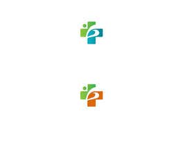
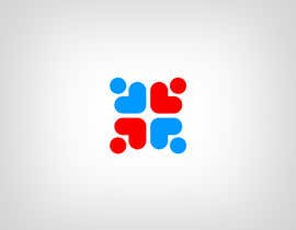
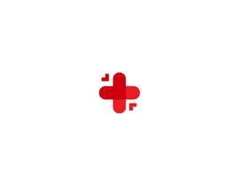
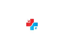
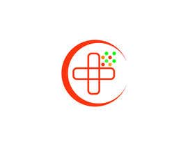
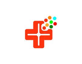
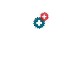
We are in need of a new mark for our healthcare marketing company. We don't want any letters in it. Our job is to bring new patients to our clients (doctors), so we'd like the mark in some way to represent that idea. We like the orange Hubspot sprocket and the green and red gears of Digital Marketer. I've attached a sample that we mocked up- but it's rough and designers should feel free to depart from it - it's just a starting place.
What we like about the sample - there is a feeling of movement - the arrows coming in to the central hub.
What we don't like - the "cross" is a little generic/stereotypical/blah. Even though we want to give the impression that we work with doctors/in healthcare, we'd like to get some imagery that's a little more outside the box. A more universal symbol of health/wellness/healing.
We'd liie to have source files at the end of the project.


Objavi svoj natečaj Hitro in preprosto

Prejmi na tisoče vnosov S celega sveta

Dodeli natečaj najboljšemu vnosu Prenesi datoteke - Preprosto!