Karpion
Turkey

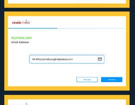
We have a credit app:
https://green-flag-credit.leadshook.io/survey/ew3cBLXUxU3gqDjVghRtIptUpHH8wfJJlRBePAFo
CSS is also attached.
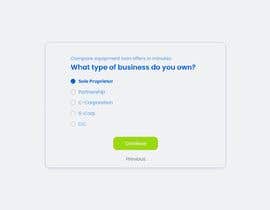
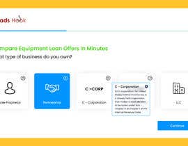
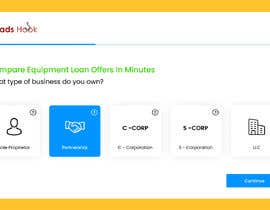
Functionally it is pretty good. What would you do to make it more pleasing to the eye and more user-friendly?
Perhaps centering the buttons, or use of Icons instead of just words like S-Corp would make it more interactive? The consumer can jump off and it will pick up later where they need it to..
Maybe combine 2 questions on a page to make the number of pages drop?
We like simplicity, and if you can find a way to make the form into a simpler design, you could win. Simple is good, but we need some recommended color choices as well.
We also need some good ideas to make things like social security number be only visible as it's being typed, with the proper masking as well. Same with EIN, which is the same sort of number but for a business.
“Great problem solver. Good eye for color and proportion. ”
![]() appro, United States.
appro, United States.


Objavi svoj natečaj Hitro in preprosto

Prejmi na tisoče vnosov S celega sveta

Dodeli natečaj najboljšemu vnosu Prenesi datoteke - Preprosto!