narusehikari
Indonesia

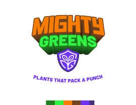
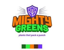
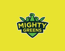
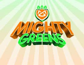
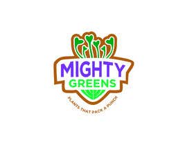
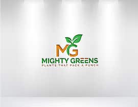
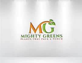
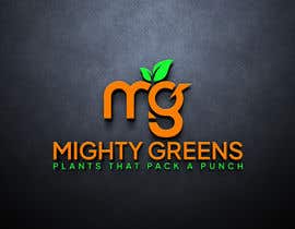
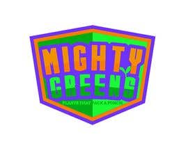
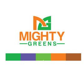
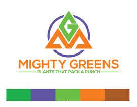
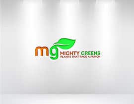
The brand's name is "Mighty Greens". Our main products are microgreens (tiny plants/vegetables that have not reached full size), and the slogan is "Plants that pack a punch".
Our brand plays off of the idea that these tiny products are highly nutritious, super flavorful, pretty, convenient, fresh, and great for our health; they are like food superheroes.
We are in search of two VECTOR logos:
a) a full logo that includes the complete name and slogan;
b) a simplified version of the logo without slogan to use in small spaces
c) please select a font that we can then use in other media (like our website, etc.). Please share with us the fonts that you use.
We're envisioning that the word "Mighty" in the logo extends upward as if it is extremely tall, conveying power and might. "Greens" connote nature, organic material, and health. Note that in the future we want to have brand characters, which would be sprouts depicted as superheroes. This part of the description is crucial to the logo design. We will message two examples of logos that approach the idea of the text that extends upward.
It’s important to note that we are one of many microgreens companies in our market; what makes us different from all the other companies that also sell little plants is that we are “mighty” so we want to convey strength, good health, powerful amounts of nutrition, etc. What's most important is that our logo conveys that we are both a friendly and credible company (not a frivolous, kids' game).
The logo will be featured on stickers that enclose the plastic clamshell (product packaging), on our website, on social media, in emails, in printed advertising material, on T-shirts, and other places. The isotype (the image alone without the company name) needs to independently represent the company and our products. In other words, we want to be able to use the image/isotype to easily and clearly reference the company name, without explicitly mentioning it, for use in small spaces (for example, a stamp to be used on a customer rewards card; a matrix of repeated logos—we will message this example). Attached is an example from a company called Princeton Microgreens--it includes a primary logo with the full company name as well as a small isotype that references but doesn’t explicitly mention the company name. Note that we do not actually like these logos; we just like that there is a small version of the isotype that refers to the original logo and company name. Remember that we want to be able to use our logo in different places/media and different layouts.
Attached to the project are images of the products we will sell; these will also be the inspiration for the superhero characters we want designed in the future.
The color palette is also attached to the project. Please use these colors in your design. We'd like to see "Mighty" in orange, "Greens" in green, and "Plants that pack a punch" in purple, but we are open to other interpretations that use our color palette.
“Great work! I loved working with Aprilia. She goes direct to the instructions an she did as many changes i needed. I will definatelly work with her again! ”
![]() arigut, Paraguay.
arigut, Paraguay.


Objavi svoj natečaj Hitro in preprosto

Prejmi na tisoče vnosov S celega sveta

Dodeli natečaj najboljšemu vnosu Prenesi datoteke - Preprosto!