Marianavzla
Venezuela

We are currently a successful store that has been running for 27 years.
We are now extending our shop into a Local Department Store, growing in size (approx 400 sqm) and specialising even futher in all the fields mentioned below:
-Stationery - Back 2 School
-Office Supplies
-News Agent
-Art/Craft and Hobby
-Party Items
-Toys
-House Hold Gifts
-Seasonal Gifts - Mothers Day, Christmas, Easter, Valentines, Summer etc...
-Printing (everyday, schools and banners)
-Fitness (dumbells, home small fitness equipment etc..)
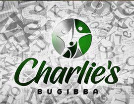
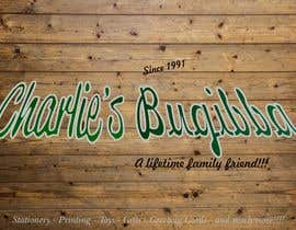
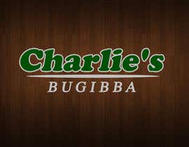
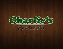
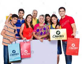
We would like our like new updated logo to be similar to the old one in colour and maybe a similar font. But we also would like the logo to give the customer,general public and new customers a sense of Reliability, Professionalism and a Family approach .
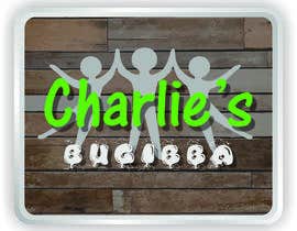
Below I have attached the old logo and a draft sketch I have made myself just to give an idea of what we are after.
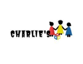
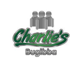
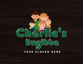
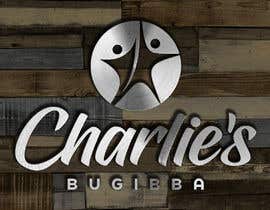
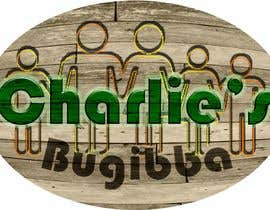
The 'Dolls' behind the logo are to represent FAMILY. Meaning the store is a family store were we literally cater for every AGE and every OCCASION throughout the year. We are open to adding more dolls or leaving it at 3.
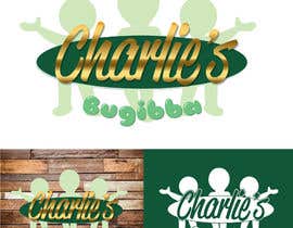
We would like to have the actual name, Charlie's in the same green as it currently is, but giving it a 'SPECIAL EDITION' type of Upgrade. We were thinking maybe adding a 'STEEL LIKE' outline around it.
The idea behind the steel is that in our Tv advert, we would like to have the Dolls walk towards eachother from opposite sides of the screen, and when they come together the name 'Charlie's' falls from above. The dolls have to catch 'Charlie's' being a heavy name. The heavy weight concept is to represent that Charlie's is a reliable store that has been around for a while. This way we can prove to new customers that we already have a good reputation.
The word 'Bugibba' is the town we are in . So the new name of the shop will actually be ''Charlie's Bugibba''. The idea behind this, is so people kind of look at our store as the towns' main shop where they literally can purchase all of their needs.
In the Tv advert we were thinking that after the dolls catch 'Charlie's', Bugibba will just appear in a bubble font. I have attached another photo just for you to get an idea of what i mean by a bubble font.
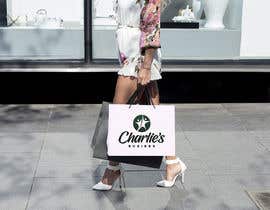
Preferably we would like this logo to be 'stuck' on a background of 'raw wood like' planks placed horizontally behind the logo. So the colour scheme of the entire store and logo is , white, steel, green,grey and this raw like wood colour.
Newspaper may also be added(not required) as it is how our story started. Inside the store will be adding newspaper wallpaper.
I think thats all we had to explain, we are open to any ideas as long as the logo gives an impression of Reliability, Professionalism, Good Customer Services and that it is a Family Oriented Store.
Thank you kindly for your time and patience :)
Glenn


Objavi svoj natečaj Hitro in preprosto

Prejmi na tisoče vnosov S celega sveta

Dodeli natečaj najboljšemu vnosu Prenesi datoteke - Preprosto!
