Design a company logo

  • Stanje: Closed
  • Nagrade: €100
  • Prejetih vnosov: 181
  • Zmagovalec/ka: alexsib91

Navodila natečaja

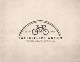
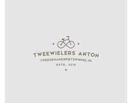
Design a company logo in EPS format. The logo will be used on our new website (landscape format) and in our shop (square or landscape format, does not matter). So the text in the logo should be sort of responsive.

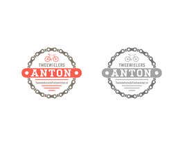
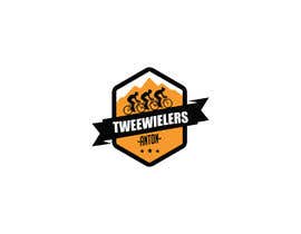
The following text should be in the logo:
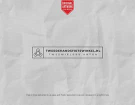
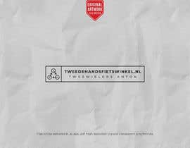
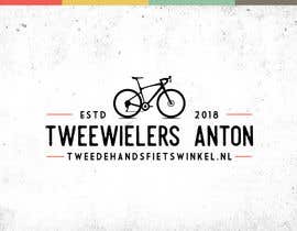
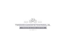
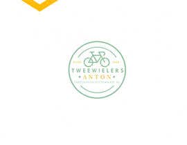
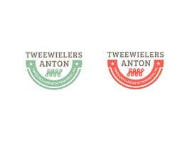
TWEEWIELERS ANTON
TWEEDEHANDSFIETSWINKEL.NL

Or without Caps:
Tweewielers Anton
TweedehandsFietswinkel.nl

Does not matter if you use CAPS or not. The text "Tweewielers Anton" can be implemented small somewhere in the logo. It should be readable on a small website logo. The website name "tweedehandsfietswinkel.nl" can be bigger. That is what we want to communicate first.

Note: do not look at the current website style. There will be a new website with this new logo.

Business:
We sell used bicycles from our shop and we repair bicycles. Both you can implement in the logo but not necessary.

Style
We like a RETRO / vintage look of the logo but also MINIMALISTIC. I prefer more minimalistic than retro if you are not sure which style to make.
I included some example of logos I like (collected from the internet). It should be something like these logos but with our text. It can look quite similar to the logos I attached, but do not make a copy. You can use a bicycle or gear for example. Do not use sharp edges (like sharp points for a gear if u use it). I like round designs.

Colors:
Use white background and black logo. You can use one color, I like this. I attached some vintage colors I like you can use.

Priporočene spretnosti

Delodajalčev feedback

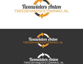
“Alexander won the contest for logo we are using.”

Profilna slika dovodadesign, Netherlands.

Najboljši vnosi tega natečaja

Poglej več vnosov

Javna tabla za pojasnila

  • JenyJR
    JenyJR
    • pred 5 let

    Kindly check this entry as well sir....." https://www.dropbox.com/s/lnjdnmh5gr3ebit/bicycle22.jpg?dl=0 " ....thanks

    • pred 5 let
  • JenyJR
    JenyJR
    • pred 5 let

    Kindly check this entry as well sir....." https://www.dropbox.com/s/lnjdnmh5gr3ebit/bicycle22.jpg?dl=0 " ....thanks

    • pred 5 let
  • ronjames1928
    ronjames1928
    • pred 5 let

    I am late Ihave minimalist logo concept inbox me ch

    • pred 5 let
  • JenyJR
    JenyJR
    • pred 5 let

    #224 and #225 ....please check and feedback...thanks

    • pred 5 let
    1. JenyJR
      JenyJR
      • pred 5 let

      Kindly check this link as well sir....." https://www.dropbox.com/s/lnjdnmh5gr3ebit/bicycle22.jpg?dl=0 " ....thanks

      • pred 5 let
  • ntmai
    ntmai
    • pred 5 let

    Please check #213 , #214

    • pred 5 let
  • eddesignswork
    eddesignswork
    • pred 5 let

    #210 Please Thanks...

    • pred 5 let
  • JenyJR
    JenyJR
    • pred 5 let

    Kindly check and feedback #202 , #203 and #204 ....thanks

    • pred 5 let
  • mdelias1916
    mdelias1916
    • pred 5 let

    #200

    • pred 5 let
  • mdelias1916
    mdelias1916
    • pred 5 let

    #199 #200 #201

    • pred 5 let
  • shahadat62
    shahadat62
    • pred 5 let

    please check #186 , #187

    • pred 5 let
  • dovodadesign
    Nosilec natečaja
    • pred 5 let

    Just to compare we want to see some design with this recycle icon: https://tinyurl.com/ybm9c22h
    We sell USED bikes. So this icon seems us very interesting to involve in our logo. The logo does not have to be very retro. It could also have a little bit of modern touch. Good luck and thank you in advance!

    • pred 5 let
    1. kaosarkhan
      kaosarkhan
      • pred 5 let

      modified #181 Please check this

      • pred 5 let
    2. shahadat62
      shahadat62
      • pred 5 let

      Thank you for your opinion. I will try it.

      • pred 5 let
  • dovodadesign
    Nosilec natečaja
    • pred 5 let

    Thank you for your entries! We like them a lot and we have to discuss later which design will win.

    • pred 5 let
  • shahadat62
    shahadat62
    • pred 5 let

    please check #174 , #175 , #176

    • pred 5 let
  • dovodadesign
    Nosilec natečaja
    • pred 5 let

    Thank you for the entries. Use white background for the logo. No mockup please. I am very pleased with the results so far. Just missing the website name somewhere in some logo's. Add the website name next or under the logo with Tweewielers Anton.

    • pred 5 let
    1. faisalaszhari87
      faisalaszhari87
      • pred 5 let

      Good luck sir

      • pred 5 let
  • shahadat62
    shahadat62
    • pred 5 let

    please check #127

    • pred 5 let
  • shahadat62
    shahadat62
    • pred 5 let

    please check #122

    • pred 5 let
  • newlancer71
    newlancer71
    • pred 5 let

    #108

    • pred 5 let
  • Synthia1987
    Synthia1987
    • pred 5 let

    #106

    • pred 5 let
  • Synthia1987
    Synthia1987
    • pred 5 let

    #104

    • pred 5 let
  • dovodadesign
    Nosilec natečaja
    • pred 5 let

    Thank you for the firts 20 entries. I like #18 and #19 the most so far, but not yet enough to award. I like the minimalistic design of #18 , but it is to simple so far. #19 did well to mention our website name bigger and put somewhere as well the name Tweewielers Anton. But the design is just to much of lines.

    I like it modern minimal with a retro touch. Remind that the website (tweedehandsfietswinkel.nl) should be in front and somewhere there should be the name 'tweewielers anton' or just 'anton' if it is too long.

    Good luck and thanks again!

    • pred 5 let
    1. Synthia1987
      Synthia1987
      • pred 5 let

      #31

      • pred 5 let
    2. rinkalbabariya
      rinkalbabariya
      • pred 5 let

      sir #19 i mine logo plz check #99 i make another one i hope you like thanks

      • pred 5 let
  • rinkalbabariya
    rinkalbabariya
    • pred 5 let

    plz check #99 sir

    • pred 5 let
  • dovodadesign
    Nosilec natečaja
    • pred 5 let

    Thanks for the great designs! I have rated the top logo's with maximum of 3 stars.

    Tip: try to make the logo with the text 'Tweewielers Anton' and write the website name (tweedehandsfietswinkel.nl) next (or under) it. I see both names in the logo is to much text in one logo. Good luck!

    • pred 5 let
  • shahadat62
    shahadat62
    • pred 5 let

    please check #79 , #81

    • pred 5 let
  • arman016
    arman016
    • pred 5 let

    Please check my entry #75

    • pred 5 let
  • emam2222
    emam2222
    • pred 5 let

    check #74

    • pred 5 let
  • emam2222
    emam2222
    • pred 5 let

    check #71

    • pred 5 let
  • arifulronak
    arifulronak
    • pred 5 let

    Please check #68

    • pred 5 let
  • newlancer71
    newlancer71
    • pred 5 let

    Looking for a better rating FOCUSING on web text .... please check entry #52 ... Would be nice any comment. Thank you.

    • pred 5 let
  • AvishekM
    AvishekM
    • pred 5 let

    Hope you like #17 , please review and feedback for further modification. Message me for variations. Thank you. :)

    • pred 5 let
    1. dovodadesign
      Nosilec natečaja
      • pred 5 let

      Thank you for #17 . I like the round minimalistic logo, but I dont like the images and fonts unfortunately.

      • pred 5 let

Pokaži več komentarjev

Kako začeti z natečaji

  • Objavi ta natečaj

    Objavi svoj natečaj Hitro in preprosto

  • Prejmi na tone vnosov

    Prejmi na tisoče vnosov S celega sveta

  • Dodeli natečaj najboljšemu vnosu

    Dodeli natečaj najboljšemu vnosu Prenesi datoteke - Preprosto!

Objavi natečaj zdaj ali pa pridruži se nam še danes!